Templates come with a specialised set of blocks, for dealing with dynamic template data.
Each element comes with tons of design options and features related to the element in use.
Available Elements
Post Title
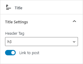
Display the post title and choose which heading tag to use (from h2 – h6), optionally link to the post.
Excerpt
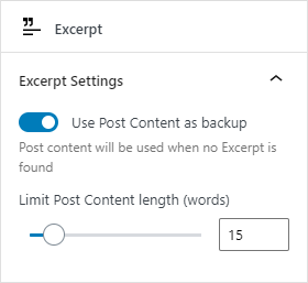
This will display the post excerpt if one has been set.
If the option use content as backup is enabled, a shortened version of the full post content will be displayed and shortened to a number of words.
Author
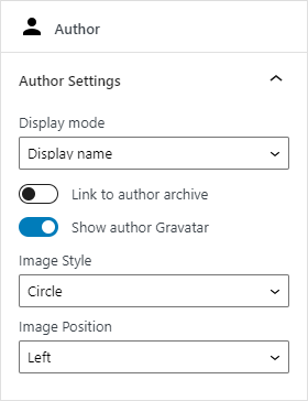
Show the post author and optionally the author’s Gravatar.
Choose to display the name as: display name, full name, nick name, first name or last name.
The author Gravatar can also be positioned to the left or right of the name and scales with font size.
Taxonomy
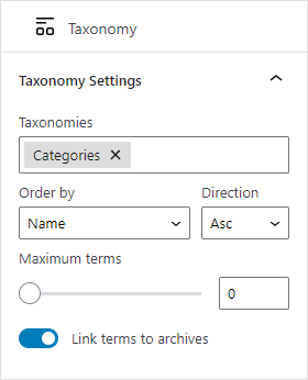
Choose a taxonomy, or multiple taxonomies, (this can be tags, categories, product attributes, and any other custom taxonomy) and have all the relevant terms pulled in and displayed.
Then order those terms by: name, slug, term ID, term order and count.
You can set a maximum limit of terms to display as well as optionally having the terms link to their respective archives.
There are additional design controls for terms, so you can style the terms seperately from the container (terms have Typography, Color, Border and Spacing panels).
Custom Field
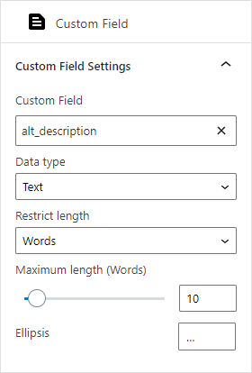
Copy & paste your custom field name to set it, or use the auto suggest (search as you type) to locate your custom field name.
The Custom Field element supports 4 data types.
Text
Restrict the text length by words or characters and choose a custom ellipsis if the text is shortened.
Number
Choose from number formatting options such as decimal places, custom decimal point and custom thousands seperator.
Link
Sets the custom field to be the link source + enter a text label for the link itself.
Date
Format the date from our preset options, or create a custom date format.
HTML
The HTML data type has no options, and will render basic html tags and attributes (ie – from a rich text editor).
Published + Modified Date
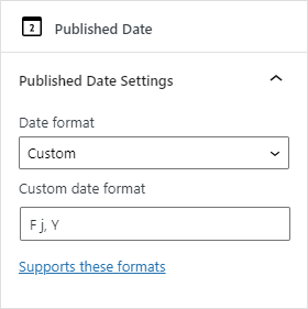
There are two seperate elements, Published Date and Modified Date with the same set of options.
Format the date using predefined date formats, or create your own using the custom option.
Supports these date formatting options.
Link
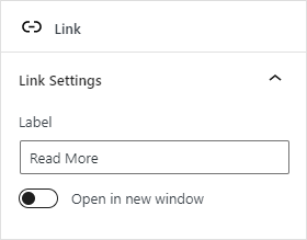
It links to the current post…
Custom links are on our roadmap.
Text
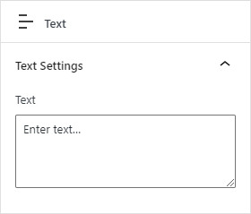
This is a basic element for inserting text with built in support for shortcodes.
Rich Text blocks are on our roadmap.
Comment Count
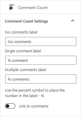
This is an element for showing how many comments a post has – you can update labels for 3 different scenarios: no comments, a single comment, and multiple comments.
Use the percentage symbol – % – to position the actual comment count number.
Featured Image
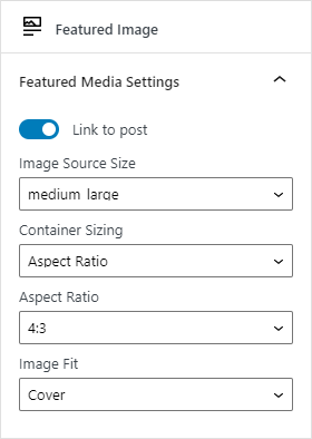
The featured image element has a bit of a unique behaviour. It only locks to the position top, right, bottom, left – and can’t be positioned with drag and drop.
Choose an image source appropriate for the template to ensure a high quality finish for your designs.
Depending on whether the image is displayed vertically or horizontally in the template, there will be various display options such as: aspect ratio, stretch width, cover section, contain image.
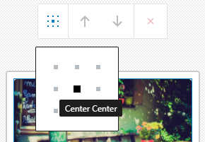
This element also has a toolbar control for aligning the image in its container:
Additional element options
All elements come with the following design panels in addition to the individual options above:
Typography
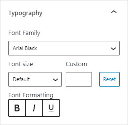
Set font family, size, formatting and line height as well as bold, italic and underline.
For elements that support links, there are also be hover options to set bold, italic and underline for that state.
We plan to add more font options to the font family selector either using the Gutenberg APIs (coming soon it looks like) or we’ll integrate with Google Fonts.
Color
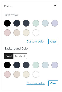
Set a background color and gradient, as well as change the text/foreground color.
For the featured image element, setting the foreground colour will change the color of the image placeholder.
Border
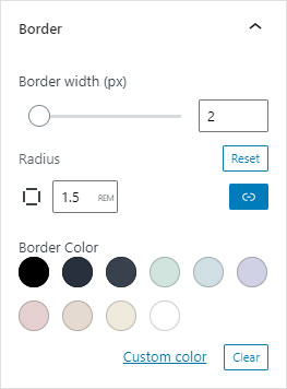
Change the border radius (rounded corners) and width. Control each side (for width) or corner (for radius) value individually.
Includes color picker for border color.
Supports multiple unit types for radius and width: px, %, rem, vh, vw.
Spacing
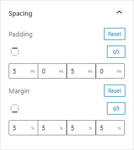
The spacing panel allows you to add margins and padding to any element.
Padding is the space inside the element – set a background colour to see the element grow.
Margin is the space around the element – the element itself stays the same size.
Each dimension (top, right, bottom, left) can be controlled individually, with support for separate unit types: px, %, rem, vh, vw.
Advanced
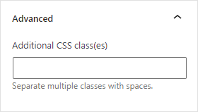
Every element supports the addition of a custom CSS class, giving you granular control over your templates and elements.